BRAND DESIGN
SAFA Hibiscus Refresher
We developed a holistic brand identity and comprehensive set of guidelines designed to help this new karkadeh drink show up confidently in the North American market.
From packaging and photography to social, campaign, and experiential design, every element was developed as part of one cohesive visual world. The result is a flexible brand system designed to help SAFA show up consistently, confidently, and memorably wherever people encounter it. 🌺
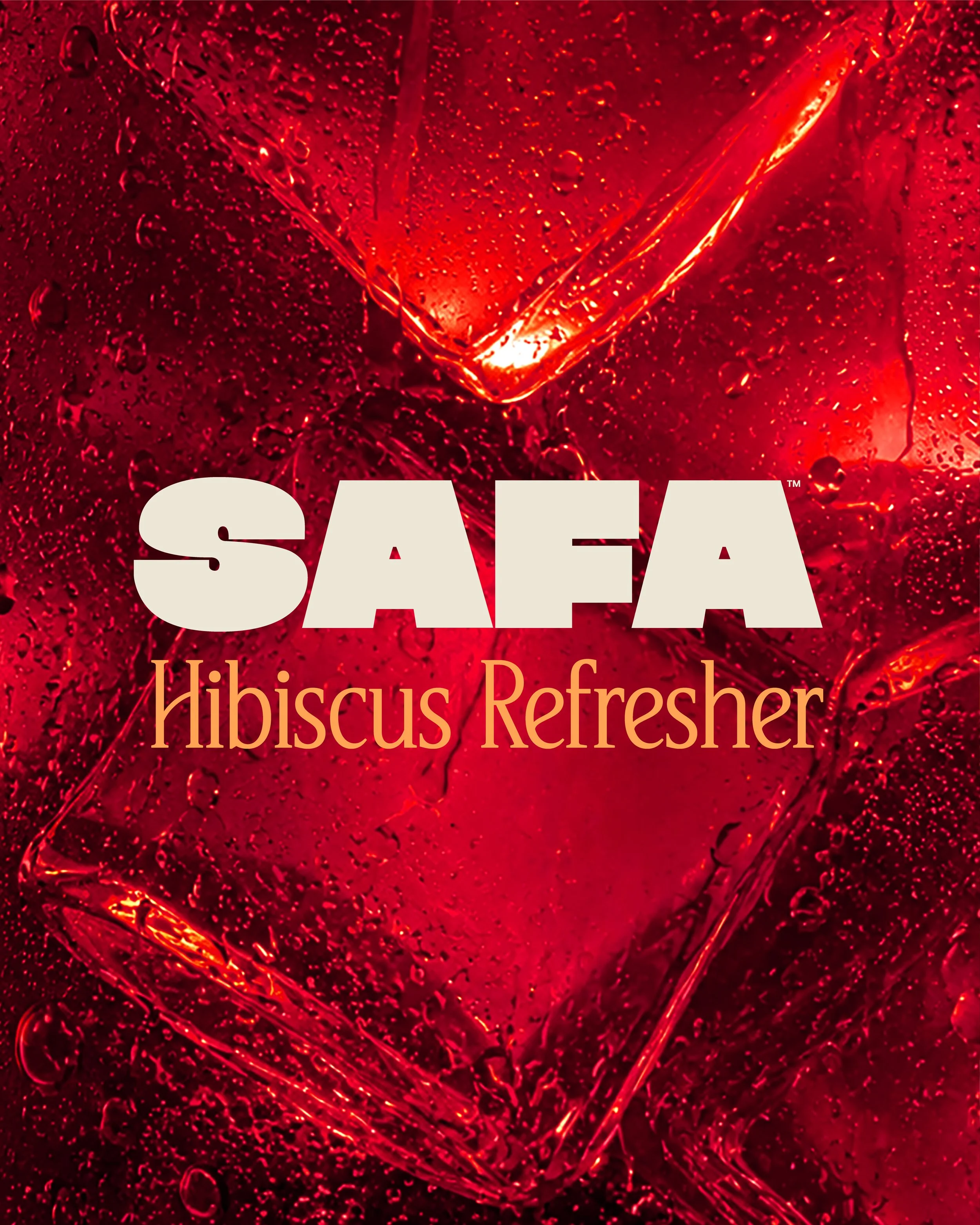
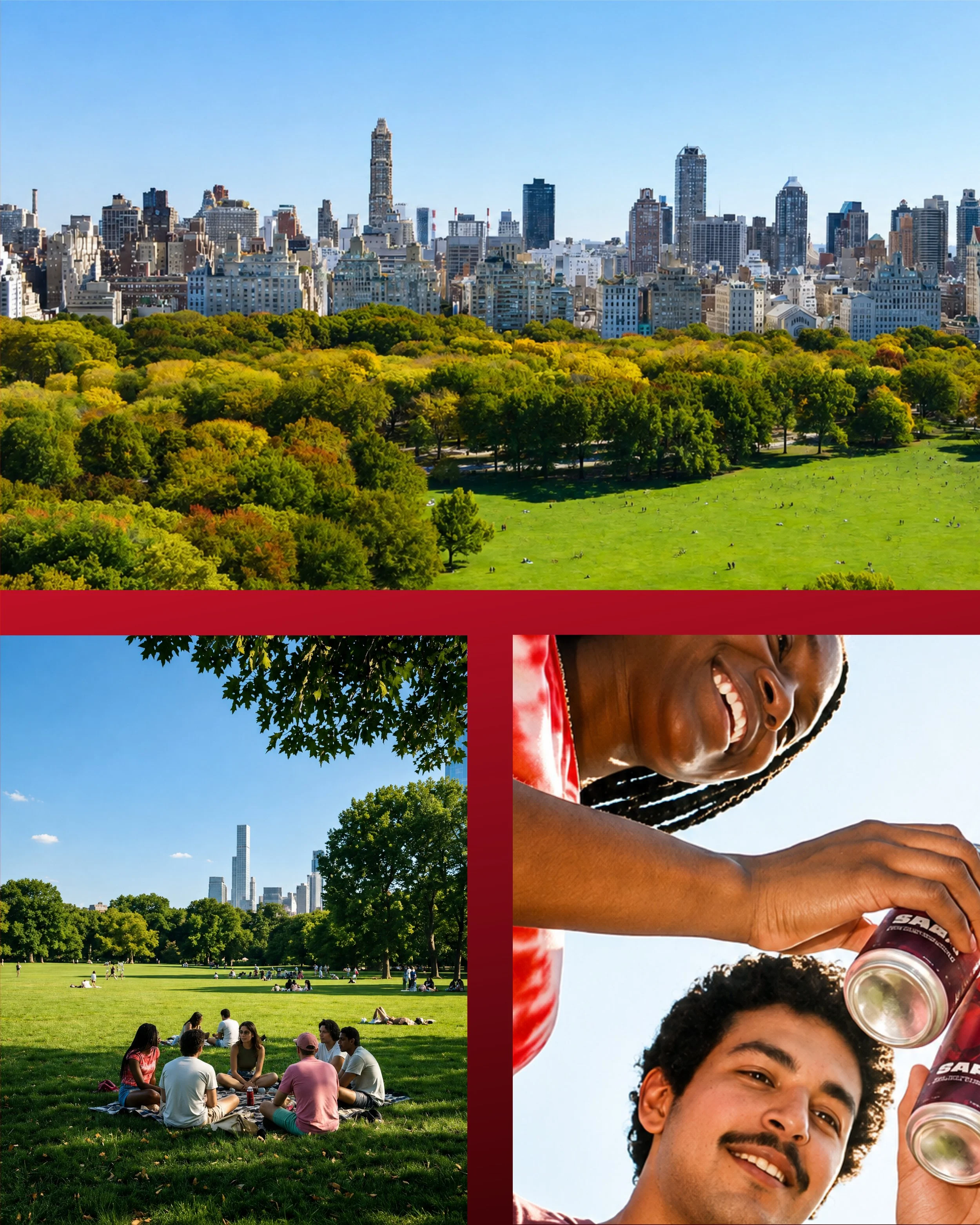
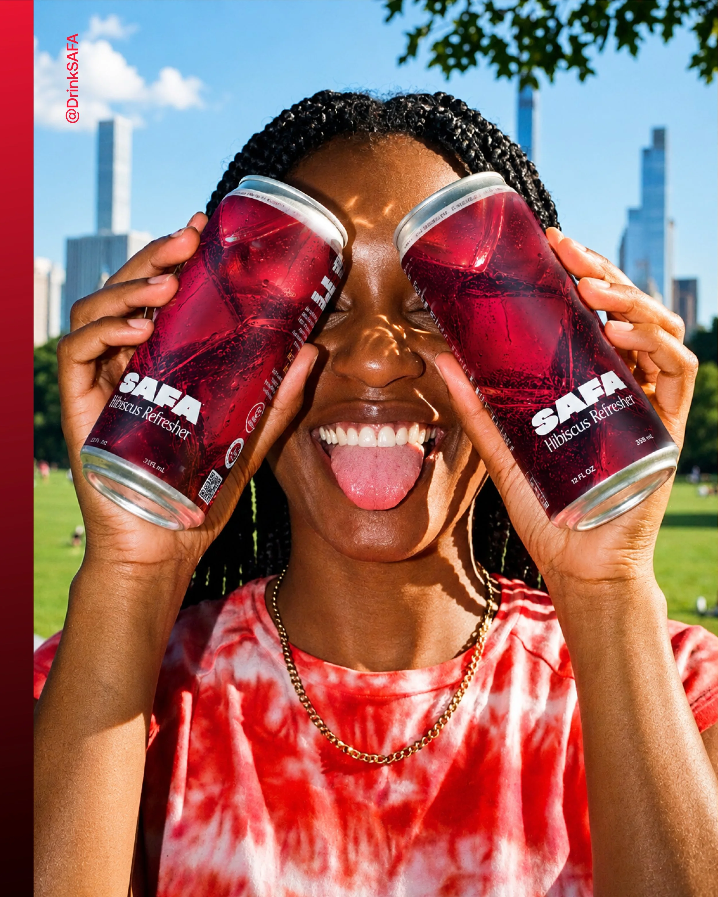
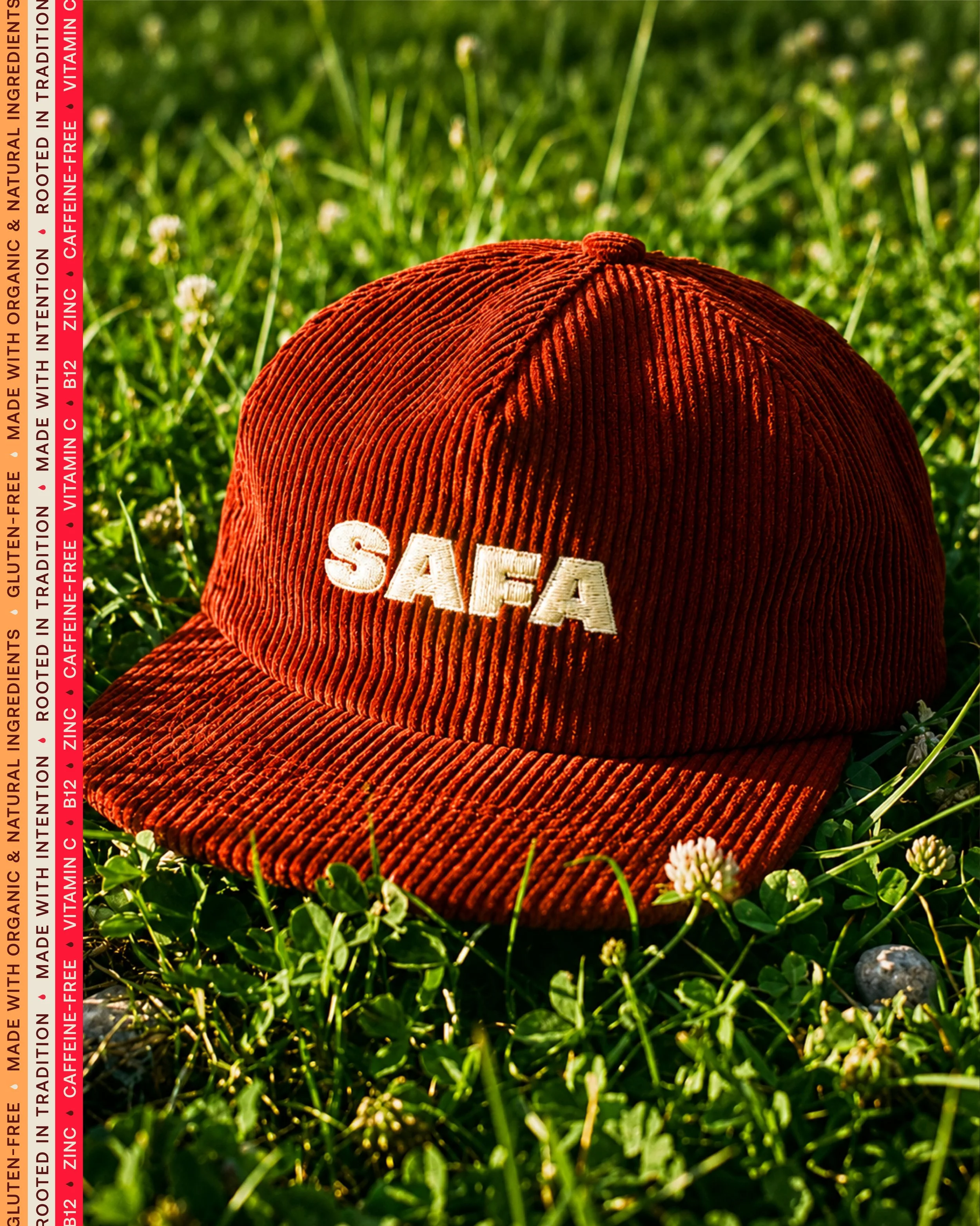
Building on SAFA’s new brand identity, we created a campaign system designed to bring the world of Hibiscus Refresher to life. Bold color, vibrant photography, playful typography, and oversized hibiscus florals create a visual language that feels fresh, social, and unmistakably SAFA.
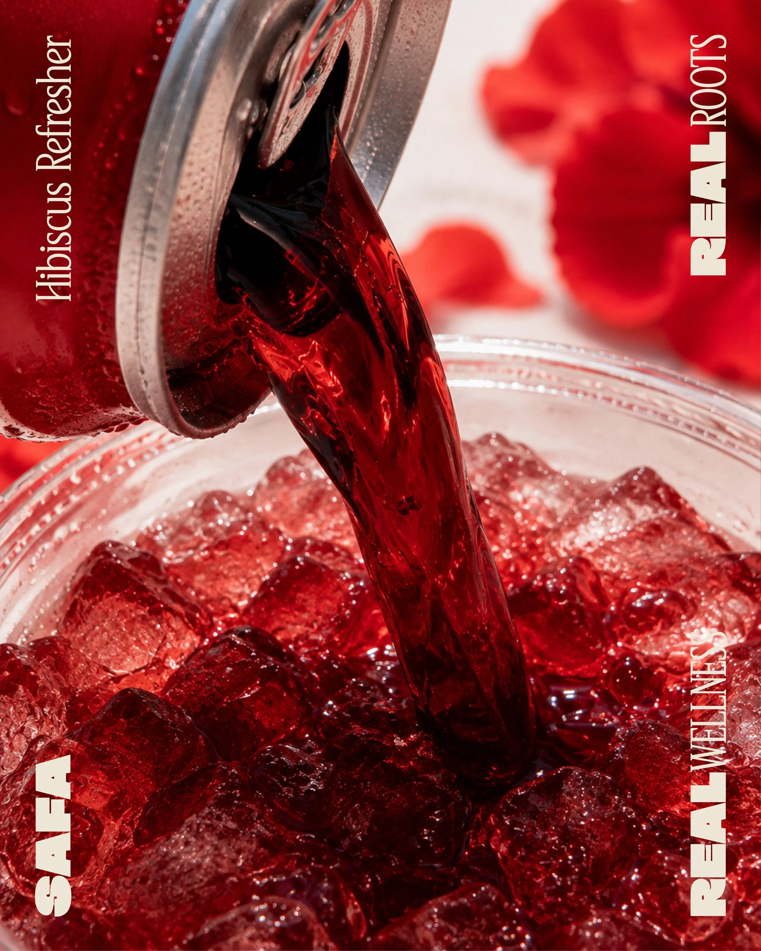
Rich reds, crushed ice, condensation, and the deep color of karkadeh put refreshment front and center. The photography direction celebrates the product itself while reinforcing the vibrant visual language established across the SAFA brand.

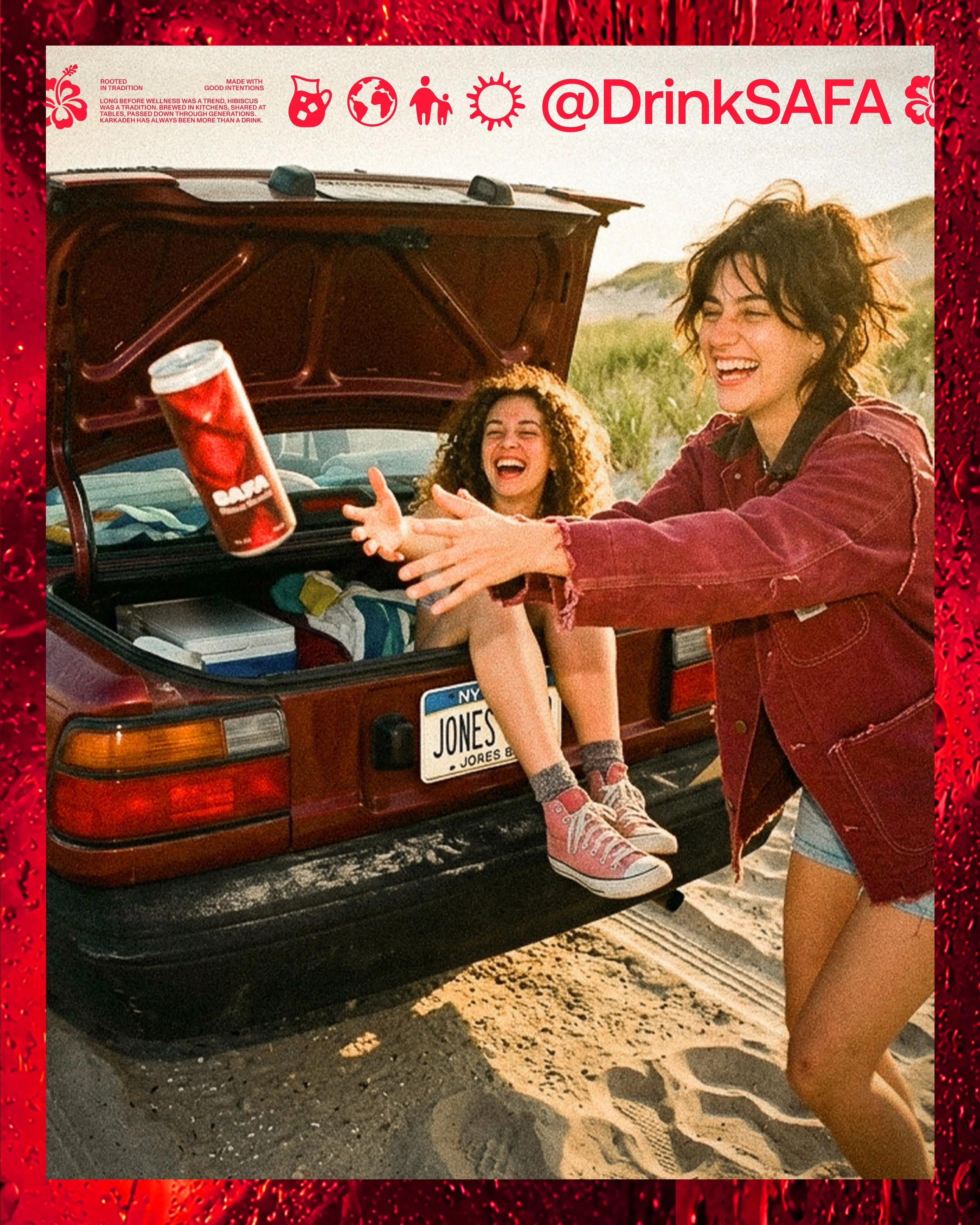
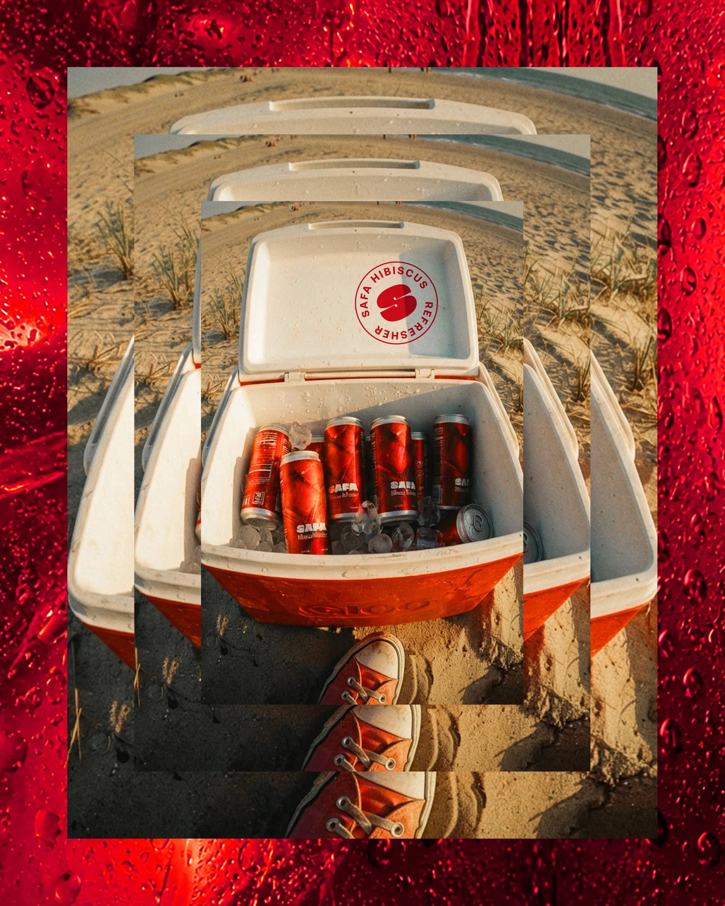
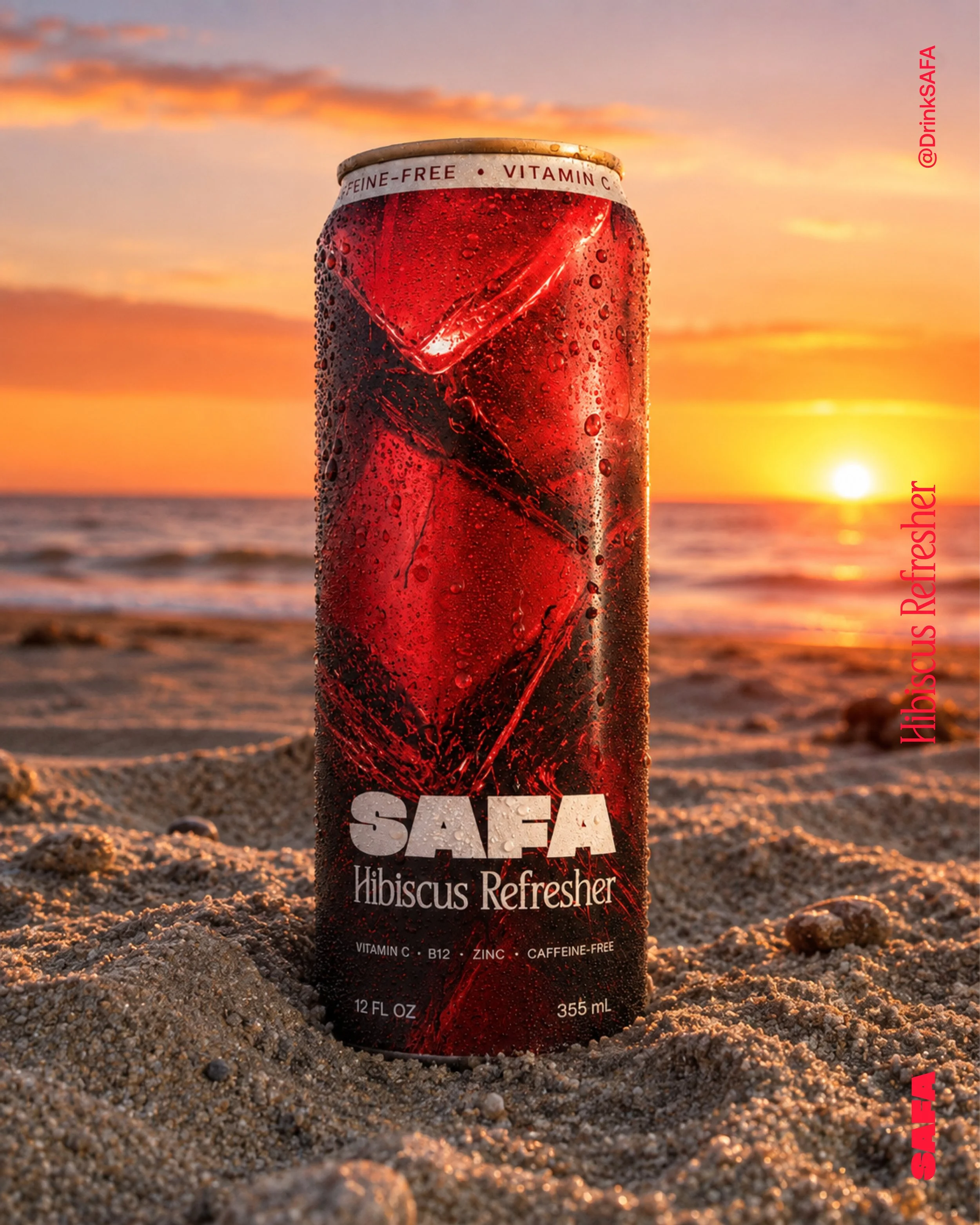
Designed to stop the scroll, SAFA’s social system combines expressive imagery, bold graphic moments, and a flexible brand toolkit that can continually evolve with new content.
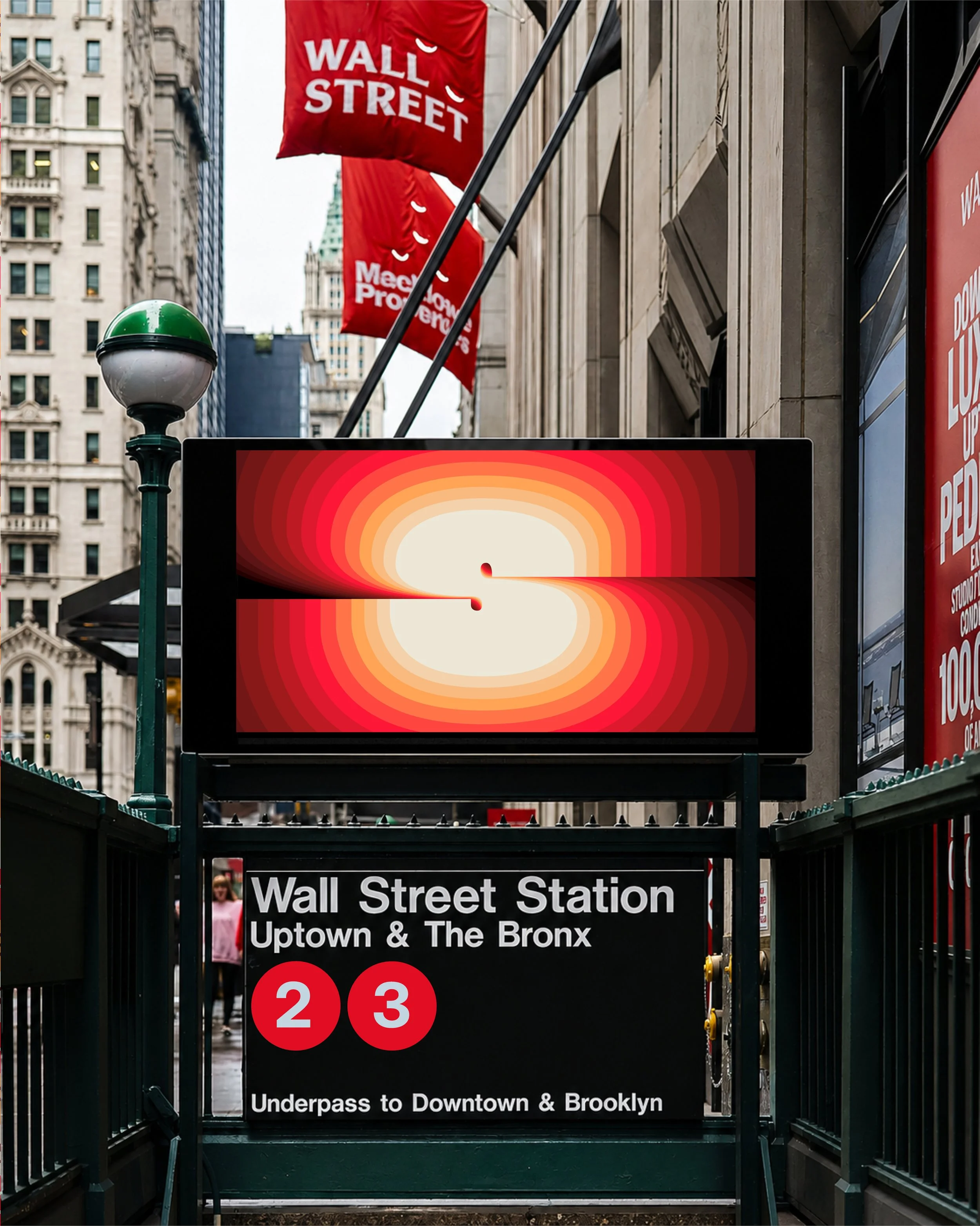
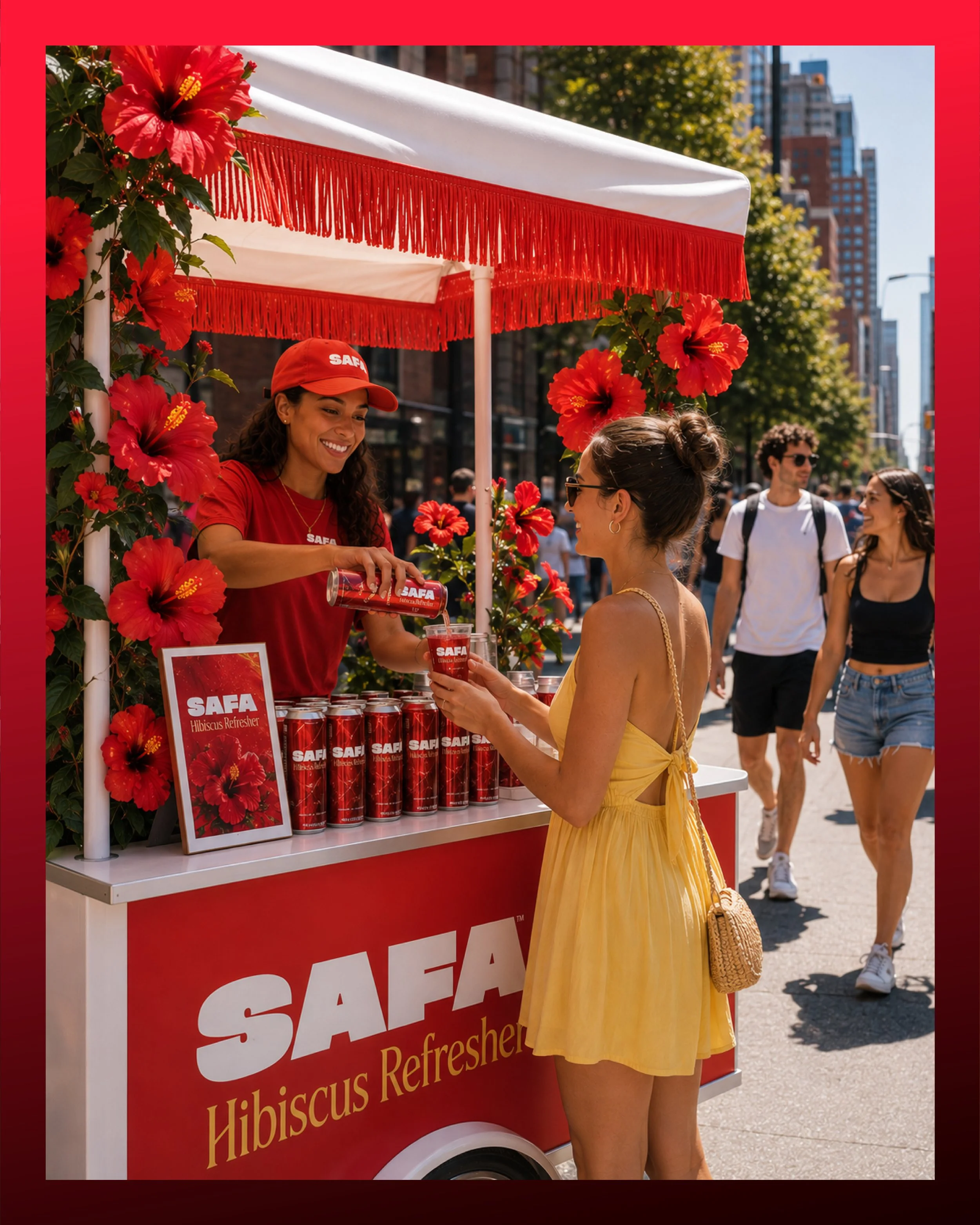
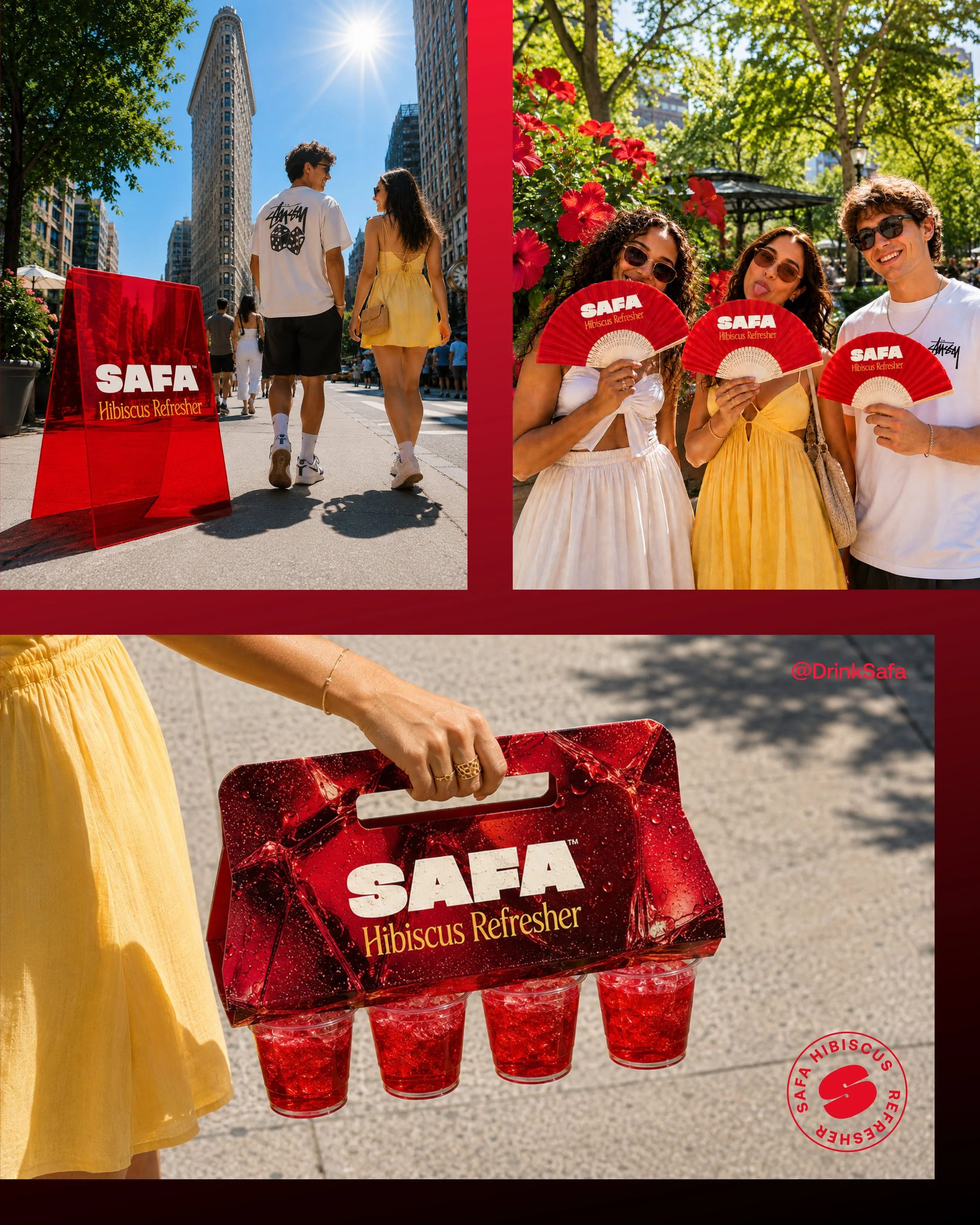
We extended the campaign into the physical world, imagining how SAFA could show up through sampling, pop-ups, branded carts, signage, and other moments of discovery. Each touchpoint was designed to feel like a natural extension of the brand rather than simply a logo applied to an object.